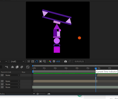
· - Top part of T will tilt back
and forth balancing on the triangle.
· - The transit in scene to P
will be a zoom in
· - T and P in the different scenes
to concentrate on each transformation of the letter
T zoom in transition P
Assignment 2
Animated Poster
Book Name: Divergent
Images used and Photoshop process;
background landscape:
Shows the whole overview of the ruined city the book is set in giving a better idea of the type of setting the book is about.
Photoshop:
Focusing only on the ruined city and removing the skies and birds.
Background 2:
The background behind the landscape of the city. The city will blend in with the image. The color gives a dirty rustic vibe to the poster especially its texture of it.
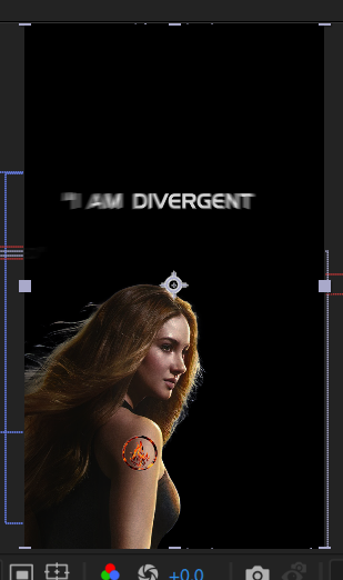
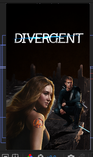
Title:
Using the iconic title which is eye-catching.
Photoshop:
Cropped and removed the black background.
The Symbols Five Factions:
To give a better idea of what it is based on as the story shows the difference between the five factions. Also shows that the community is separated.
Photoshop:
Photoshopped only the logo of the factions and the shadow to make it stand out than being flat.
Dauntless logo:
One of the Factions is called Dauntless which the protagonist (Beatrice Prior aka Tris) is in. This logo has a flaming fire behind which shows the fiery of the faction.
Photoshop:
Removed the black background. Use to show which faction Tris is in and also it will stand out from the Five Factions above.
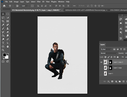
One of the Dauntless leaders:
His name is Four and a love interest of Tris. This image of Four matches perfectly with the background because of the lighting and he will be able to be placed in front of the Poster.
Photoshop:
Played around with the contrast, lighting and etc to fit the concept.
Tris:
The main Character. the image is another version of the one above because it matches the concept and the mood.
Photoshop:
Edited to fit the contrast and color as the image of Four above.
Color Scheme:
Rustic dark and metal like colrs
Next step:
Pilling up the edited images in one file on Photoshop, editing it more, and playing around with the colors. Adding shadows and removing and adding shadows.
Step 1: Create a black background
size: 1080px x 1920px
Step 2: Adding the Landscape, adjusting and choosing the best part of the landscape image. adding shadows and blending the building behind to the black background so it doesn't look awkward. Adjusting the color to match the rest of the edited images from before.
Step 3: Add the Black and brown background. Since the photo is short, the reason why I added the black background from before. As I need the brown part to start from the top of the buildings behind.
Further adding contrast and adjusting the color.
Step 4: Adding the characters. Choosing the best positions for each. Also adjusting as I go along.
Step 5: Adding the Title. And temporarily adding the logo as it will disappear later on.
After importing the files, create a new composition with the imported files. Import the audio for guidance to match the movement of the images to the beat. Started off by playing around with the movement of the logos. Wanting a smooth circular 3D movement by using scaling and position, making the logo come from the back, moving to the front in a circular pattern.
The logos line up into a wave pattern going across the screen and the words 'five factions' appear from the left to the center.
I made the logos and the words move to the right except for the fire logo to show the importance of it.
Two light grey lines move at different movements, swirling around the logo and in a way guiding the logo to its destination.
the logo stops at a fading Tris, disappearing as soon as hits her shoulder.
The faded Tris breaks into pieces, showing the colored fire version of the same logo and a clear version of Tris
The first line moves from the left to the center.
The line moves upward and disappears.
The new line appears but disappears after a line passes over it.
The buildings and black/brown background move from behind Tris to its position.
Four appear from the right.
A blue line goes across an appearing Title DIVERGENT. Moving in a free curly line across the screen.
The Title becomes clear, reaching the end of the animated poster.
Lastly creating a new composition to add the last two lines and add a few touches. Along the way adjust the images and their timing to match the background music.
Assignment 3: OPENING TITLE SEQUENCE
Create a motion graphics title sequence project name as MARI BELAJAR BERSAMA CYBORG
References ideas for character
Final Character design
Character animation frames (procreate)
Procreate
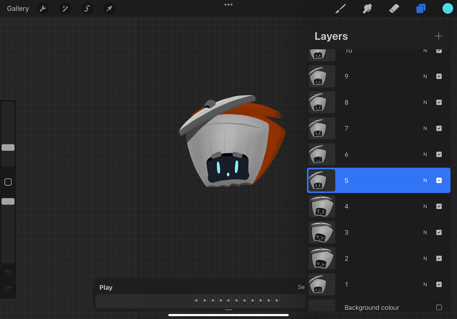
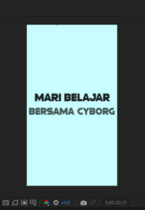
Scene 1 of the cyborg
Color Scheme : Bright colors
to attract all ages when watching, especially the younger generations
Progress
not the beginning of the video. Intro will be Mari Belajar Bersama Cyborg, Simple actions can make a big difference. After zoom in to the sleeping Cyborg Trash Can.
Wind blows the trash can. will insert wind sound
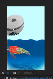
plastic bag blows by
scene changes with the plastic blows away into the see
cyborg follows behind
the plastic will be the transition to the cyborg showing the end result of not throwing away the plastic trash in the bin. by him popping up from the bottom and images popping up from the back.
then cyborg shows how simple it is to just pick the plastic trash up and put it in its body.
Continuation Progress
Procreate part 2
The intro
The title will fade in one by one the top 'Mari Belajar' then 'Bersama cyborg' come right after.
A wave swirls over which is the color of the background throughout the video. The color of the title changes from white to black.
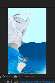
Scene after The transition of the plastic from the scene of the turtle swimming:
The first line is when the cyborg appear from the bottom and says "This is horrible".
After he jumps back and says "It's way worse than you think".
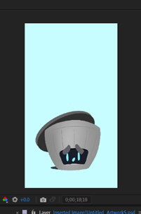
Images pops up showing the consequences of literating saying "It is estimated that over one million animals die each year due to litering".
The images disappears, the he says "not only does it affect animals but you too!".
The next scene the cyborg drops down and disappear from the screne.
For the next scene, the cyborg jumps in from the right and picks up the plastic bag by flipping it up and falling straight into the cyborg. the cyborg then jumps facing the front and leans forward to let the viewer throw their trash in like something easy. He leans back in his spot. while these actions takes place the cyborg says "don't be lazy or careless... help by throwing your litter in the trash can".
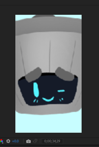
After leaning back the cyborg looks more happy, The scene ends with a zoom in and a wink from the cyborg.
Then the zoomed in cyborg morph and swirls like the wave in the intro.
The sound effect for the voice was applied in After Effect (for better accuracy to the frames)
Images used for the pop ups. All images are public pictures, so no copyright
Adobe Premiere Pro (last step)
- Added sound effects
- A fading to black transition between a few of the scenes to make it smoother.
- Wrote outro "A short video by: Tanisha Panagary"


Comments
Post a Comment